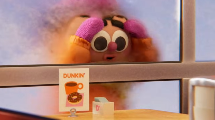
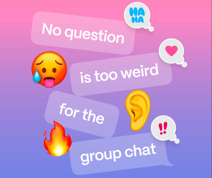
0
Skip to Content
Liana Krakirian
Motion Design
Character Animation Reel
Ask the Storybots - Rigging and Technical Animation
Design + Illustration
About
Contact
Liana Krakirian
Motion Design
Character Animation Reel
Ask the Storybots - Rigging and Technical Animation
Design + Illustration
About
Contact
Folder: Work
Back
Motion Design
Character Animation Reel
Ask the Storybots - Rigging and Technical Animation
Design + Illustration
About
Contact
Motion Design

Motion Design

Character Animation

Character Animation

Ask the Storybots - Rigging and Technical Animation

Ask the Storybots - Rigging and Technical Animation

Design + Illustration

Design + Illustration

System Foundations: Icon & Color System

I built a restrained identity system around a bold typographic mark and minimal icon. The palette is intentionally limited - neutrals for structure, with a primary accent color reserved for hierarchy moments like pricing.

Wholesale catalogue system

As the product line expanded, the catalogue became the core tool for retailers. I designed a modular layout system with consistent hierarchy, pacing, and photography rules — so it’s easy to scan, easy to order from, and still feels editorial.

Micro typography + Hierarchy

The catalog system is held together by small decisions: consistent spacing between SKUs and titles, standardized dividers, and limited accent color. the intent is clarity - clear enough for wholesale, warm enough for a small art brand.

Branding at product scale

Greeting Card Lockup: Back Brand Mark

At small scale, branding needs to be quieter. I designed a set of lockups and placement rules for card backs and labels that stay consistent across products — making the brand easy to recognize and easy to find again.

Art Print Product Label

Extending the system into a physical space

Exhibition Label: Wall Display

Exhibition Painting Labels: Printed for Wall Display

For exhibitions, the identity system expanded into wall labels, price lists, and printed collateral. The goal stayed the same: calm structure, clear information, and typography that supports the work instead of competing with it.

Promotional Adaptations

Catalogue and packaging logic carry into promotional posters and story formats. This ensures that all graphics feel consistent with the core identity while serving specific event and social needs.

To promote exhibitions, I adapted the same typographic hierarchy into print and social formats — keeping the brand visually intact across retail, physical space, and digital touchpoints.

The event posters and story formats use the same principles of heirarchy and restraint, adapted for promotional contexts.

Outcome

Pelican Press now has a cohesive visual system across posters, greeting cards, packaging, wholesale materials, exhibition signage, and social promotion — designed to scale with the product line while keeping the artwork primary.

li.krakirian@gmail.com

Made with Squarespace