Midi Health
Menopause Art History
Making menopause education feel culturally relevant, cheeky, and native to social - without undermining the credibility or clarity of the information.
Project Overview
client: Midi Health
Deliverable: Social First “edutainment” film
Timeline: Seven Days
Team:
Executive Creative Director, Designer, Copywriters, and me as Motion Design Lead
The Brief
Create a social-first spoof art history video
Use Venus De Milo as an anchor to frame menopause symptoms through a recognizable cultural reference
Create something dynamic and energetic enough to hold attention in-feed
Maintain Midi’s playful, candid and approachable tone
Introduce deliberately lo-fi, handmade motion quality
Work within a tight timeline (7 days total) and social production budget
The Motion Challenge
Midi had a visual identity, but no motion precedent
I needed to create energy and personality without compromising clarity or exceeding production scope
The storyboard combined captions, camera movement, character animation ideas and graphic elements without a unified behavioral system
The execution approach needed to be achievable within the seven-day schedule
Concept Development
Creating Systems and Structure
Establishing Motion Hierarchy
Camera pushes create the primary rhythm
Consistent timing and easing establishes continuity
Deviations are reserved for punchlines or important beats
Hand drawn elements and stickers add a throughline of recognizable branding, and add rhythmic texture
Character animation as punctuation
Used selectively rather than continuously
The goal was not “more animation”, but the right distribution of animation
Social-Native Clarity
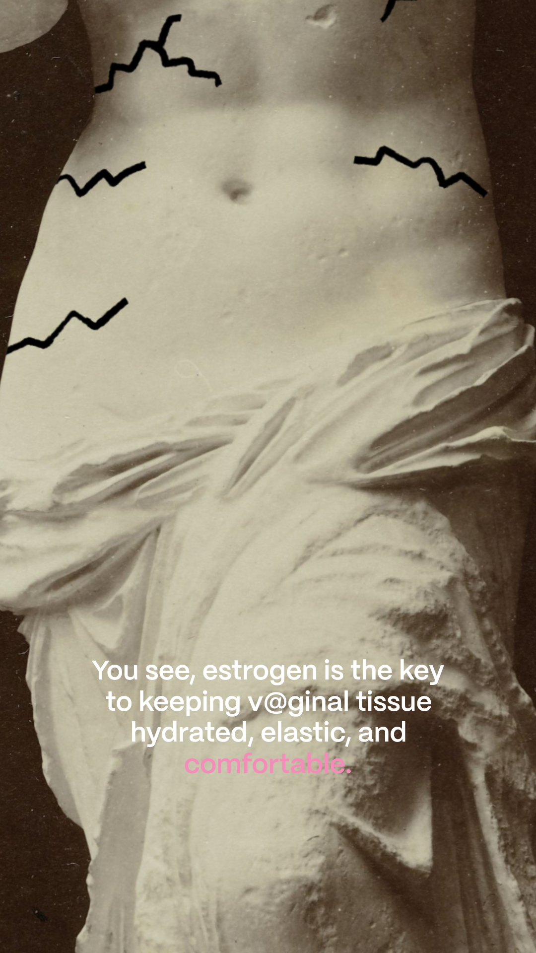
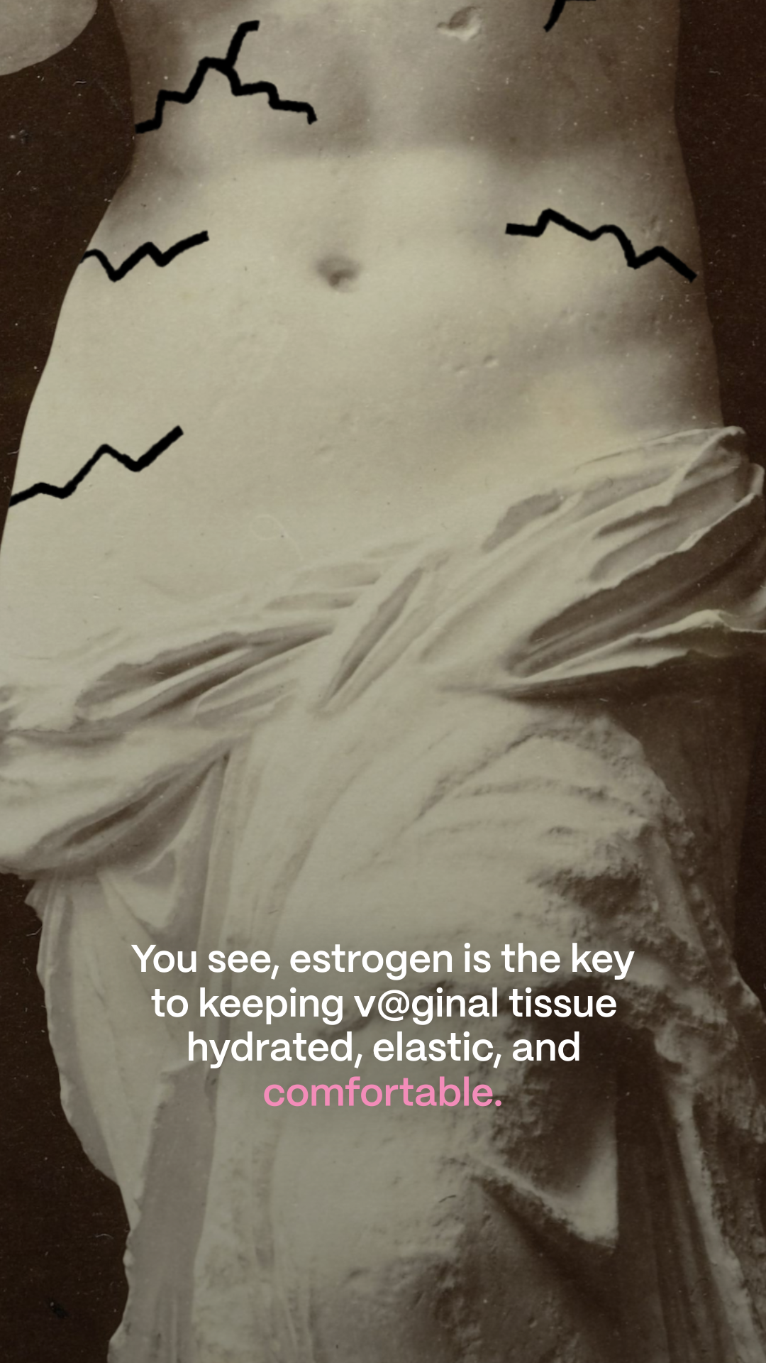
The Camera and CC animation treatment felt contemporary and native to the feed
Captions needed to read instantly on the phone
Camera movements and captions used simple, smooth, high frame rate animation
Developed a subtle value contrast treatment so Midi’s pink remained legible over the artwork; the design team later adopted it for future pieces
Handmade, but systematic and scalable
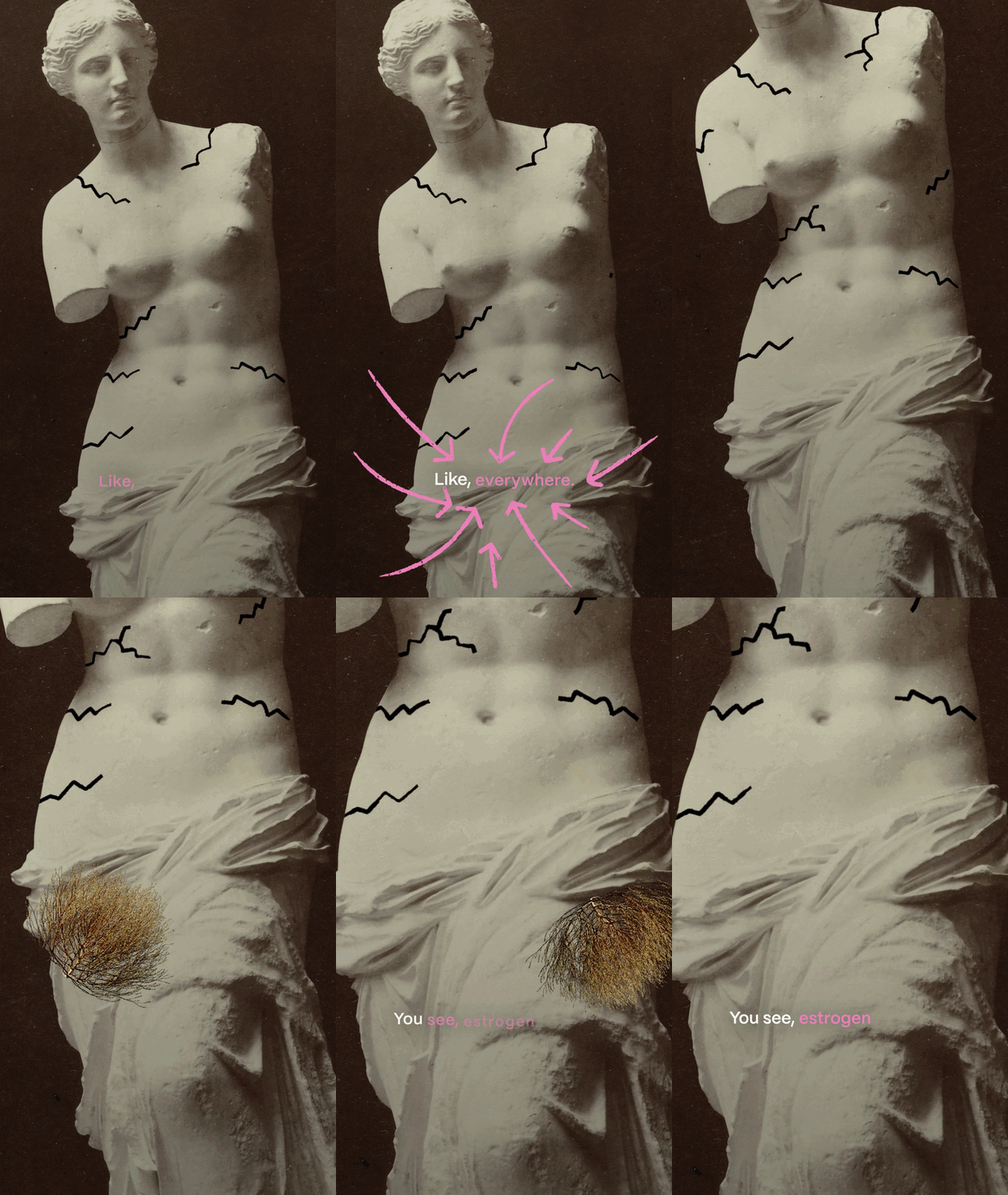
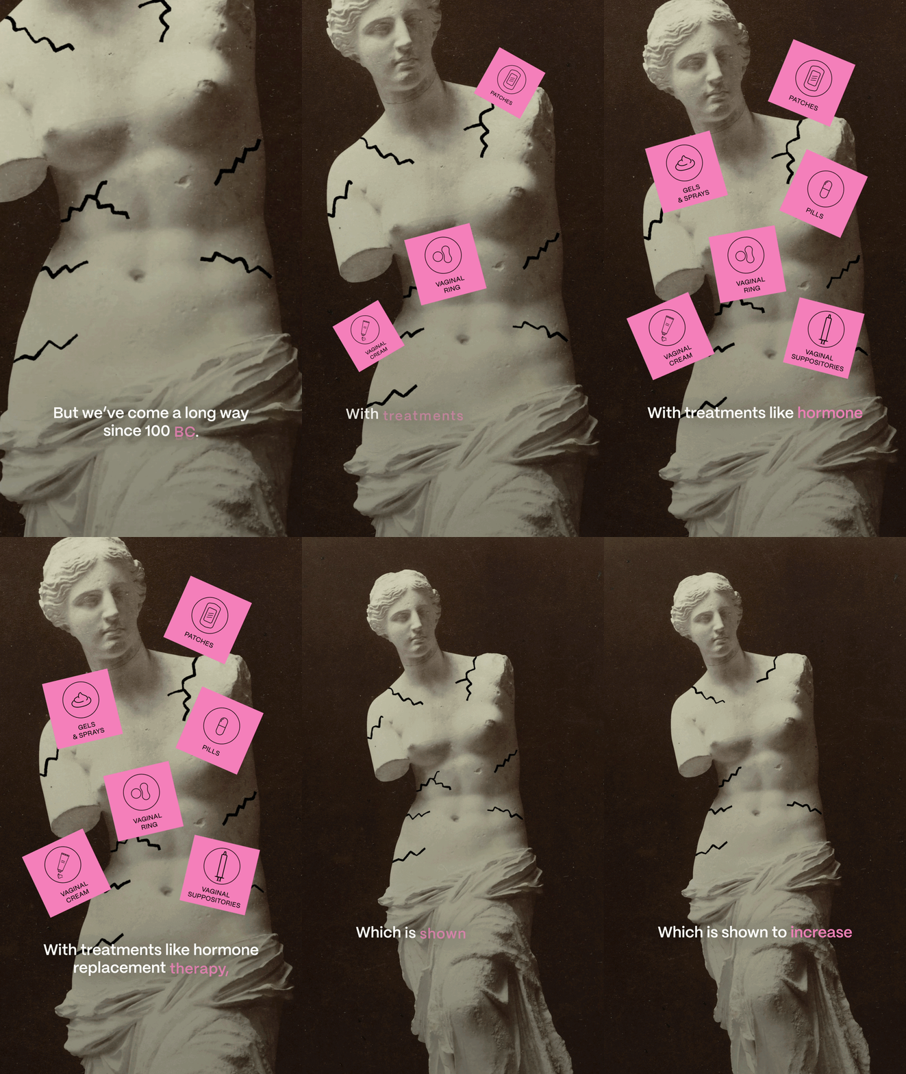
Hand-drawn lines, stickers, and character animation shared a lower frame rate cadence
All low frame rate elements updated on the same frames to avoid visual noise
Drawn linework also received a subtle boil and texture treatment
Stickers and character animation retained lower frame rate without the additional texture
Stakeholder Management and Collaboration
structured Reviews around key decisions
R1 – Foundation: Approve overall timing, VO pacing, and caption treatment
R2 – Motion Language: Approve one representative example of character animation, hand drawn animation, and sticker behavior, along with R1 Revisions
R3 – Full Visual Review: Evaluate all approved treatments working together across the entire piece. Provide Final visual notes
R4 – Sound: Updated visuals and sound design
R5 – Final Approval: Final changes and delivery sign-off
Guided feedback back to the brief
I translated requests for “more animation” into the underlying need: more energy, personality, clarity, or emphasis
I recommended the motion choice that would create the greatest impact within the scope
Camera movement often added dynamism more efficiently and helped audiences notice smaller character moments
Sometimes, a fun animation was just what a moment needed
I presented clear recommendations rather than asking stakeholders to direct every movement
Execution and Production Process
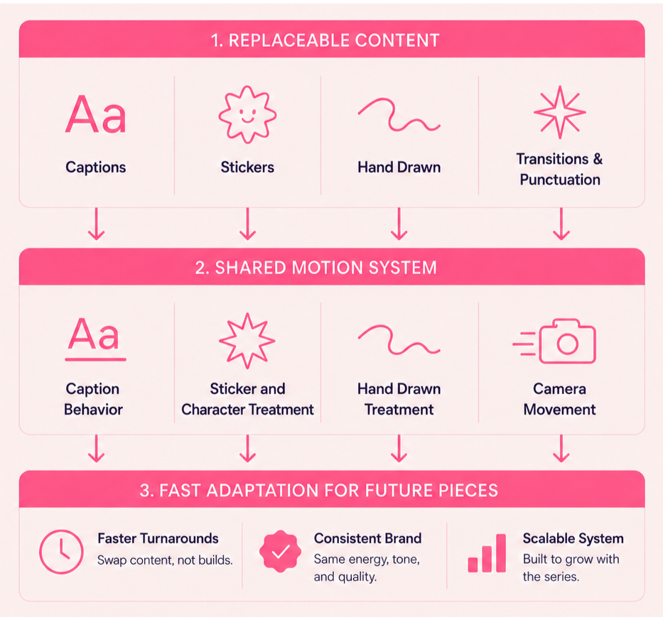
AI Assisted Asset Preparation
Used AI assisted image generation and generative fill to rebuild separated artwork, create missing visual components, and accelerate character-animation setup
Build a repeatable production template
Hand-drawn lines, stickers, and character animation shared a lower frame rate cadence
All low frame rate elements updated on the same frames to avoid visual noise
Drawn linework also received a subtle boil and texture treatment
Stickers and character animation retained lower frame rate without the additional texture
Why this mattered
Future pieces could begin from an established production framework rather than a blank project file
This reduced setup and supported consistency
Results, Impact, Learnings
Results
Delivered the final film within the agreed scope and seven-day timeline
Established Midi’s first cohesive motion language for this content series
Developed text legibility treatment later adopted by the design team
Gave the team a concrete reference point for evaluating future edutainment concepts
Midi’s CEO personally shared positive feedback with the marketing team
Impact
Extended Midi’s visual identity into a recognizable motion system
Created a reusable production framework for future deliverables
Helped the team focus effort on the most “bang for buck” motion choices
Learnings
Camera movement and VO editing were the strongest driver of pace
Bespoke animation had the most value when used in key moments
Reuse supported both efficiency and brand recognition
A motion system has to exist in the working files