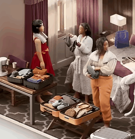
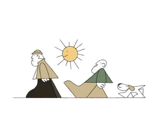
Airbnb Girls Trip
Freelance Contract with BUCK Design
I had to figure out how the 3 secondary characters’ performances support the idea of getting ready for a night out, without drawing attention away from the Hero character. I also had to determine how to make their disappearance feel seamless.
For both these problems, I tried several ideas out until honing in on this set of solutions. For example, the girls on the right were initially sitting on the bed chatting, and stood up as the camera move began. This broad movement not only took attention away from the hero, but didn’t further the idea that they were getting ready for a night out. It also meant the leftmost girl felt “left out” of the group.
when I joined this project, the Previz and Design were set in place, the concept was set, and my task was clear: I had to define the characters’ performances as we moved from the hotel room to the bathroom. Who are they, what’s their energy, and what are they doing?
Airbnb's style guide for this campaign emphasized a tactile aesthetic. I focused on bringing that quality to life while animating the props in this scene by recording reference.
I paid particular attention to how the objects “feel”. I wanted rigid objects to maintain a sense of crispness, and I wanted to convey a feeling of softness and give for the tissues and makeup bags made of fabric.
I worked with cross-functional partners on rigging and modeling teams, my teammates on the animation team, reported to an animation lead and department head. The main stakeholders were the animation team leads, BUCK’s Creative Directors, and of course the client.
With rapidly changing client requests, I worked proactively to adapt to pivots on any given day. When major sections of the commercial needed to be reimagined on a tight timeline, I took the initiative to collaborate closely with the animation lead, leveraging her broader perspective of the overall production. I asked targeted questions and reprioritized tasks accordingly, to ensure my contributions aligned with the next review. This approach allowed me to effectively navigate the expectations of both internal Creative Directors and the client.
Collaboration
Learnings
The complexity of this shot taught me valuable lessons about guiding the viewer's eye and ensuring that the most important elements are noticed. Through numerous iterations, I discovered how subtle adjustments in the timing and scale of motion can either enhance or detract from a project's purpose.
Motion Study- Match Cuts and Morphs
Personal Work
This project’s objective was to build a visually engaging sequence that highlights seamless transitions, while defining a clear, cohesive and illustrative art direction.
Personal projects bring a unique challenge in their open ended nature. When you can make whatever you want, it’s hard to know if an idea is really “good enough”. I tackled this decision paralysis by starting with loose sketches in a free flow brainstorm. I then culled it down by removing any redundancies and keeping pieces that flowed well together, serving the project’s purpose.
Ideation

Design informs motion, so I used style references to make decisions about shape language, color, and line quality. This way, I could identify Design and Animation problems early on. Here are some examples of references I pulled before starting the design process.
Research, Gathering Design Reference

Keeping limited color palettes, simple shapes and thin line quality in mind, I started working out the design and flow of this project by refining the storyboards. This included identifying shapes that could transform into others, making color continuity choices based on that, and mapping these to technical animation solutions.
Storyboards + Color Script

The last stage before building and animating everything in After Effects! Making style frames was not only an opportunity to refine design, it layed the path for a clean and concise animation process. When all the screens in a flow are meticulously planned, there is little guesswork once it’s time to bring everything to life.
Style Frames


On this project, I learned the value of diving into ideation quickly and not being too precious about the early stages of the process. What started as a blank canvas gained momentum as soon as I began creating pieces to work with, proving that action often sparks inspiration.
Learnings
When I jumped on board for this short film, the shot layout was complete, but nothing had been animated for this campaign yet. Amidst a team of 2 other animators and a team lead, I had to define the Hero’s character and the overall visual language. The Creative Director pointed me towards a Rankin Bass Rudolph holiday special, and I went for it - giving the hero the silliest walk I could imagine. This ended up setting the tone for the commercial’s energy.
Dunkin’ Munchkins
Freelance Contract with BUCK Design
Creatively, I collaborated closely with the Animation Lead and Creative Director to hone in on the right emotions for each moment. Proactively offering up “what if’s” and trying a few loose versions of facial expressions was key to finding the right feel for story beats. The client wanted us to steer clear of anything remotely sinister, so the trick was creating emotional variety and staying away from generic cheerfulness.
On the technical side, I engaged in cross functional communication between the rigging and lighting teams to ensure functional output. For example, to make the Hero’s gloves and nose squish against the window, I set up a lattice outside of the established rigging pipeline and iterated through a few technical solutions to ensure that it would render smoothly. The lighting lead was a core collaborator in this process.
Collaboration
Learnings
This project’s directive was simple: make it fun. While deadlines and technical hiccups are an inevitable part of CG Animation, I learned to separate creative and technical thinking, allowing me to brainstorm freely without getting stuck on execution. I learned that when you trust your technical skillset and work from a clear objective, the “how” always reveals itself.